

You run your daily quality control, plot the point, see it sitting comfortably inside the lines, and move on to the first patient sample. That single habit, treating “inside the limits” as “all is well”, is the most common reason a point-of-care device drifts for a fortnight before anyone notices.
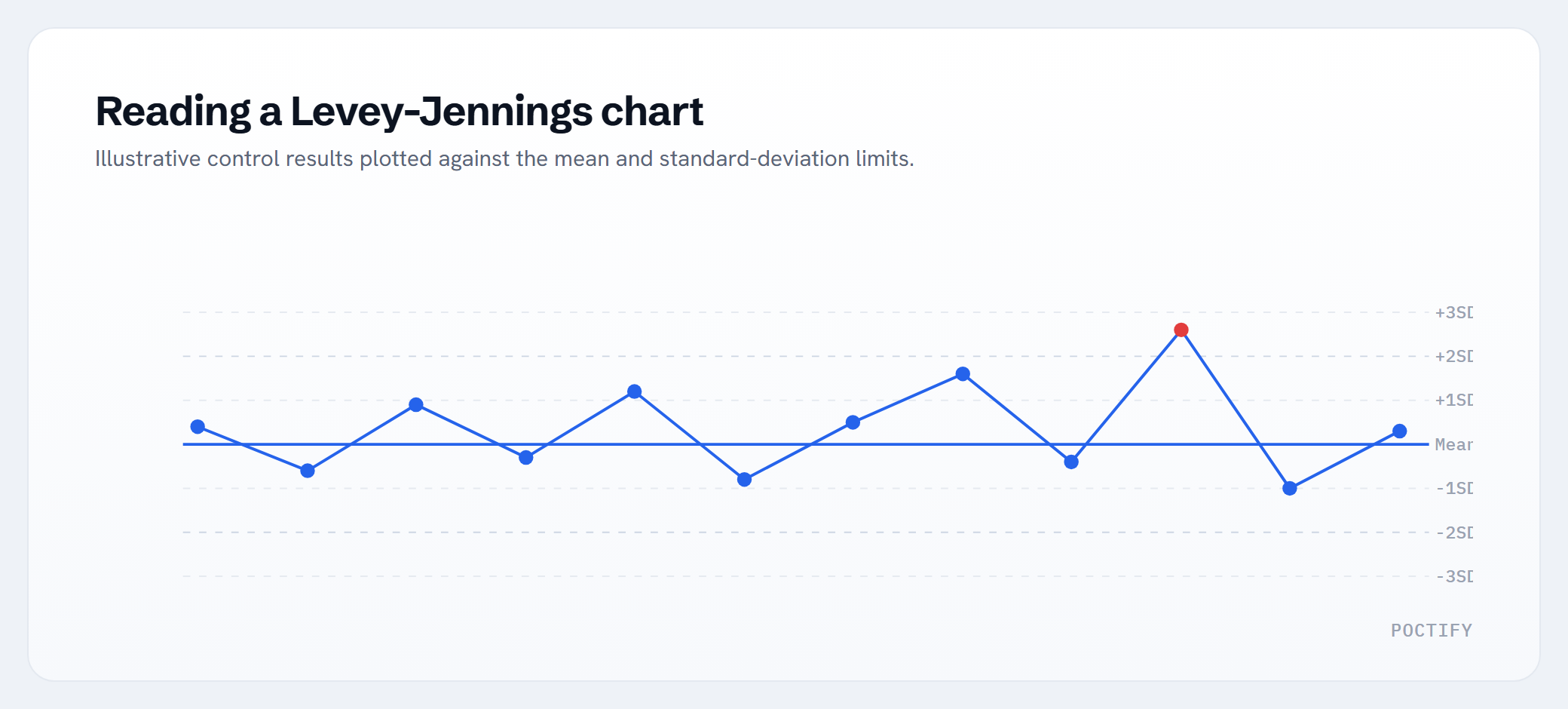
A Levey-Jennings chart is built to warn you long before a result goes wrong. But it only works if you read the shape of the line over time, not just today’s dot. The good news: you do not need a statistics qualification to do that well. You need to recognise five patterns and understand three lines. Learning Levey-Jennings chart interpretation really comes down to those two things, and this guide covers both.
What a Levey-Jennings chart actually shows
A Levey-Jennings chart is a standard deviation control chart: a simple time plot of your QC results for one control material on one analyte. The horizontal axis is time, each run plotted day by day. The vertical axis is the measured value. Across the middle sits a set of horizontal lines that tell you whether each result is where it should be.
Every chart is anchored to two numbers you establish during a settling-in period, usually at least 20 QC results gathered over 10 or more days on a stable system:
- The mean: the average of those results. This becomes your expected value, the centre line.
- The standard deviation (SD): a measure of how much your results naturally bounce around that mean.
The mean and the lines, in everyday language
The mean (the centre line)
Think of the mean as the bullseye for that control. If your low control settles at 5.2 over those first 20 runs, then 5.2 is where you expect every future low-control result to land, give or take normal variation.
Standard deviation and the 1, 2 and 3 SD lines
Standard deviation is just the typical size of the wobble. A small SD means your results cluster tightly; a large SD means they spread out. The chart draws lines at one, two and three SDs above and below the mean. Here is the plain version of what each band means:
- Inside 1 SD: completely normal. Roughly two-thirds of honest QC results land here.
- Between 1 and 2 SD: still expected. About 95% of results sit within 2 SD, so the occasional point out here is not a problem by itself.
- Between 2 and 3 SD: unusual. Only about 1 in 20 results should reach beyond 2 SD by chance. Worth a second look.
- Beyond 3 SD: very unlikely to be chance, around 1 in 370 results. Treat this as a genuine signal, not bad luck.
Those percentages are exactly why a single point near the 2 SD line is rarely a reason to stop, and why the shape of the run matters far more than any one dot.
Levey-Jennings chart interpretation: the five shapes to know
Most of reading these charts is pattern recognition. Five shapes cover almost everything you will see.
1. A stable, in-control chart
Points scatter randomly on both sides of the mean, most within 1 SD, the odd one near 2 SD, with no pattern. This is what “working” looks like. Do nothing except keep plotting.
2. A shift
Six or more results in a row all land on the same side of the mean, then carry on at the new level. The cloud of points has jumped to a new home. A shift usually points to something that changed suddenly: a new reagent lot, a fresh bottle of control, a recalibration, a maintenance event, or a new operator following a slightly different step. Action: ask what changed on or just before the day the level moved.
3. A trend
Results climb or fall steadily across several runs, each a little further from the mean than the last, marching towards a limit. A trend is gradual, not sudden. It usually signals something deteriorating slowly: a reagent or control degrading as it ages, a light source or electrode wearing, a warming fridge, or a calibration quietly slipping. Action: catch it before it crosses 3 SD, because a trend tells you a failure is coming, not that it has arrived.
4. Increasing scatter (imprecision)
The points still centre on the mean, but the spread gets wider and wider. Yesterday they hugged the centre line; this week they fling out towards 2 and 3 SD on both sides. Growing scatter is a precision problem, not a bias problem. Common causes: a failing pipette or sampling step, inconsistent technique between operators, bubbles, an analyser nearing the end of its maintenance cycle, or a control that is not being mixed the same way each time. Action: look at handling and technique first, then the instrument.
5. A single flier (an outlier)
One point leaps far out, often past 3 SD, while the points before and after sit calmly in range. A lone flier is usually a one-off event: a mispipette, a bubble, an expired or wrong-level control loaded by mistake, a transcription slip, or a clot. Action: investigate, document, repeat the control. If the repeat is fine and the surrounding points are stable, it was isolated. If fliers keep recurring, that is no longer a flier; it is scatter or an early trend, and you treat it as one.
The mistake that catches everyone
Picture six results: 5.2, 5.4, 5.6, 5.8, 6.0, 6.2. Every single one is inside 2 SD. Every individual point would pass an “is it in the limits?” check. Yet the chart is screaming. Those six values are a clean upward trend, and at this rate the next two runs cross 3 SD and the device starts handing out results that are biased high.
The operator who only asks “is today’s point inside the lines?” sees six green ticks and approves all six runs. The operator who reads the line sees a staircase and investigates on run three or four, while everything is still technically in range. That is the entire purpose of plotting QC over time: the early warning lives in the pattern, not in the position of the latest dot.
So the rule is simple. A point inside the limits is necessary, not sufficient. Always read the last six to ten points as a shape before you accept a run.
How charting over time turns guesswork into early warning
A single QC value answers a narrow question: did this one control, on this one run, fall in range? Useful, but blind to direction. A chart answers the question that actually protects patients: is this device heading somewhere it should not?
When you plot consistently, three things change:
- Drift becomes visible while it is still small and harmless, so you can recalibrate or change a lot before any patient result is affected.
- Causes become easier to pin down, because the shape and timing point you at reagent, instrument or operator instead of leaving you to guess.
- Your reaction becomes proportionate. A lone flier gets a repeat; a confirmed trend gets a calibration; an out-of-control chart gets the device stood down. You stop over-reacting to noise and under-reacting to real signals.
The size of an SD also depends on the analyte and the level you are running. A control chart for HbA1c behaves very differently from one for a fast-moving electrolyte such as potassium, because the clinically meaningful variation differs. Knowing the typical behaviour and units for the analyte in front of you makes a pattern far easier to judge, so it is worth grounding that context before you decide a shape matters.
A 30-second reading routine for every QC run
- Find the latest point. Is it within 2 SD? A point beyond 3 SD on its own usually means stop and investigate.
- Read backwards. Look at the last six to ten points as a shape, not as individuals.
- Name the pattern. Stable, shift, trend, widening scatter or lone flier?
- Match it to a likely cause. Sudden step change points to lots, calibration or a new operator; slow drift points to ageing reagents or hardware; widening spread points to technique or sampling.
- Act in proportion, and write it down. Record what you saw, what you did and the outcome. That note is what turns next month’s chart from a mystery into a story.
If you want to move beyond reading shapes by eye, multi-rule QC formalises these same patterns into agreed pass and fail rules. Our guide to Westgard rules walks through how that works in a busy point-of-care setting.
This article is educational and operational only. It is not medical advice and does not guide diagnosis, interpretation of patient results or treatment. Always follow your own laboratory’s QC policy and your device manufacturer’s instructions for use, and consult the relevant published standards, such as ISO 15189:2022 for medical laboratories.
Talk to POCTIFY
Every analyte, device and clinic has its own QC rhythm. If you would like help setting QC rules and charts that fit how your service actually runs, talk to POCTIFY. We are happy to think it through with you, with no pressure either way.
Frequently asked questions
What is the difference between a QC shift and a trend?
A shift is a sudden jump where six or more results in a row sit on one side of the mean and stay there, usually after something changed at once such as a new reagent lot, a recalibration or a new operator. A trend is a gradual climb or fall across several runs, each point a little further from the mean, usually caused by something deteriorating slowly such as ageing reagent or a drifting calibration.
What does ‘out of control’ mean on a Levey-Jennings chart?
It means a QC result has broken a control rule you have agreed to act on. The simplest is a point beyond 3 SD, but it also includes patterns such as a long run of points on one side of the mean or a clear trend. An out-of-control chart is a signal to stop, investigate and resolve the cause before reporting patient results from that run.
Should I reject a run because one point is near the 2 SD line?
Usually not on its own. About 1 in 20 valid results land beyond 2 SD by chance, so a single point out there with stable points around it is often normal variation. Repeat the control if you are unsure, but read the last several points as a shape before deciding.
How many results do I need to set the mean and SD?
A common starting point is at least 20 QC results gathered over 10 or more days on a stable system, so that day-to-day variation is captured. You then review and update the mean and SD periodically, and whenever something fundamental changes such as a new lot or a new instrument.
What usually causes increasing scatter on a QC chart?
Growing spread around the mean points to a precision problem rather than bias. Common causes are inconsistent technique between operators, a failing pipette or sampling step, air bubbles, control that is not mixed the same way each time, or an instrument due for maintenance.
Can a Levey-Jennings chart tell me whether the problem is the device, the reagent or the operator?
Not on its own, but the pattern and its timing narrow it down. Sudden shifts often follow a lot change, recalibration or a new operator; slow trends often mean ageing reagent or hardware; widening scatter often points to handling and technique. Combine the chart with what you know changed around that date.